Wordplay
A justice-centered programming language education platform
Wordplay
A justice-centered programming language
education platform
Wordplay
A justice-centered
programming languages
education platform


Project type: B2B Web App
Role: Project Manager for Designer team, UX Designer
Industry: Technology, Education
Duration: Fall 2023 - Summer 2024
Project type: B2B Web App
Role: Project Manager for Designer team, UX Designer
Industry: Technology, Education
Duration: Fall 2023 - Summer 2024
Project type: B2B Web App
Role: Project Manager for Designer team, UX Designer
Industry: Technology, Education
Duration: Fall 2023 - Summer 2024
What is Wordplay?
What is Wordplay?
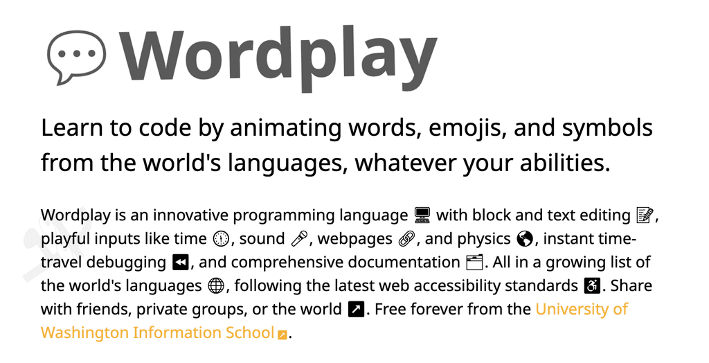
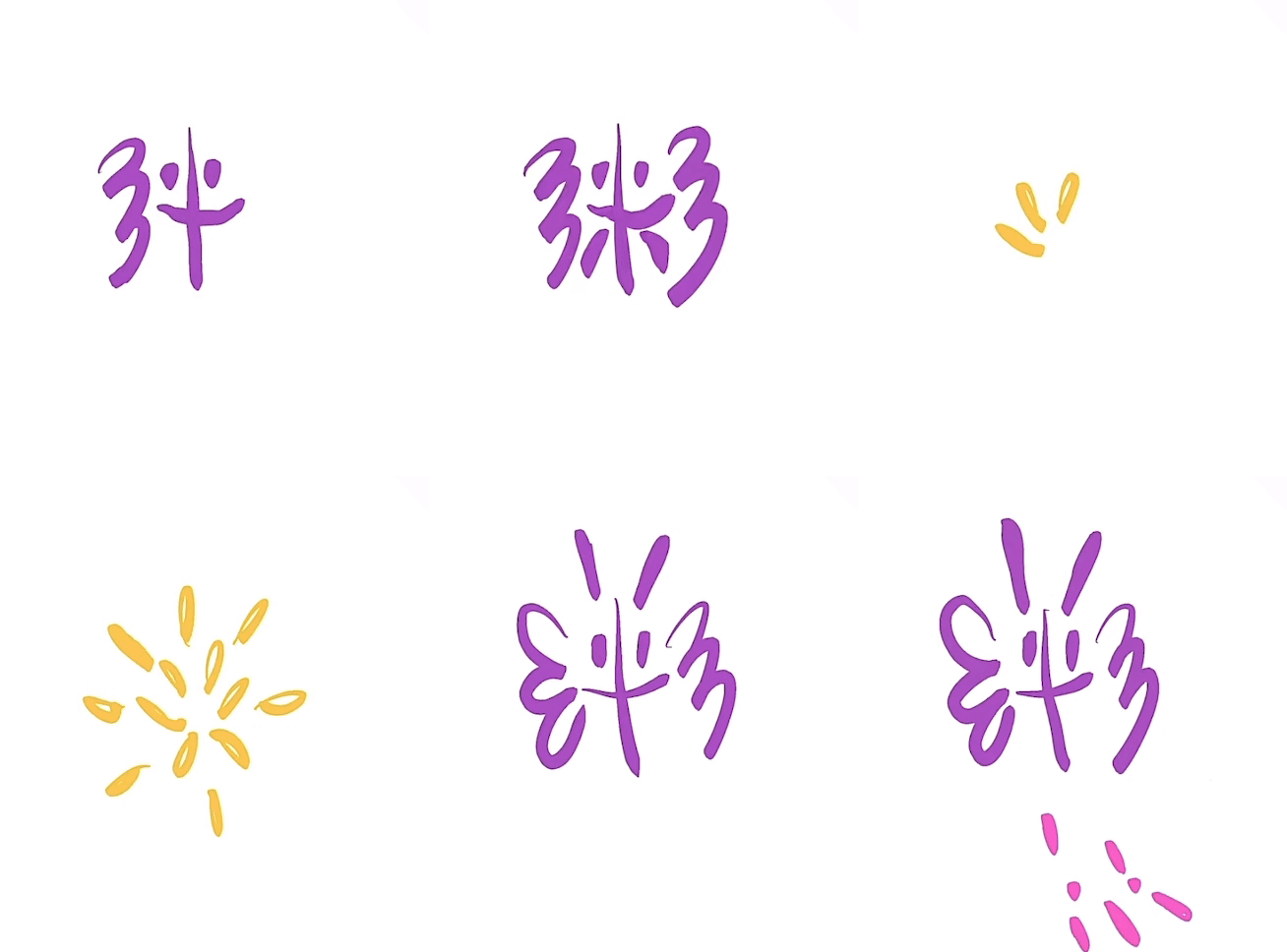
Wordplay is a web-based programming language, IDE, and platform for creating accessible, interactive typography, built at the University of Washington, organized by Professor Amy J. Ko.
This language is designed to create a straightforward and accessible programming enlightenment platform for non-native English speakers and individuals with visual or hearing impairments.
Click here to view our beta version of Wordplay.


My contribution 1:
Redesign a more compelling homepage
My contribution 1:
Redesign a more compelling homepage
My contribution 1:
Redesign a more compelling homepage
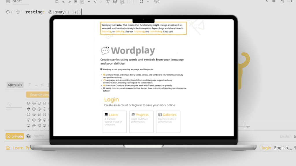
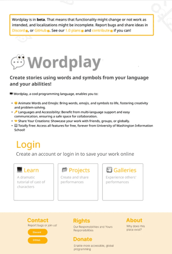
Previous Homepage Design vs. New Homepage Design
Previous Homepage Design
vs.
New Homepage Design
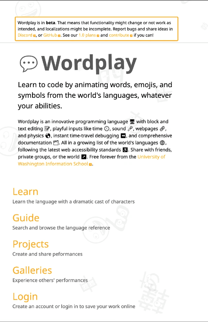




Previous design
Text-heavy design cluttered the page, making it hard for users to focus on individual sections.
Text-centric panels lacked a clear, clickable appearance, reducing engagement.
New design
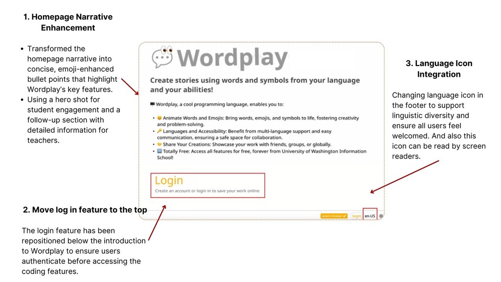
Reorganized homepage components for a more intuitive layout.
Simplified lengthy sentences to enhance readability.
Structured panels into distinct, block-like sections for visual clarity and easy navigation.
Moves additional information into footers, creating a dedicated space for these elements.
Back to the design process:
Our Objective
Align the homepage with its intended audience
and emphasize our justice-focused mission.
Define: Who are we designed for?
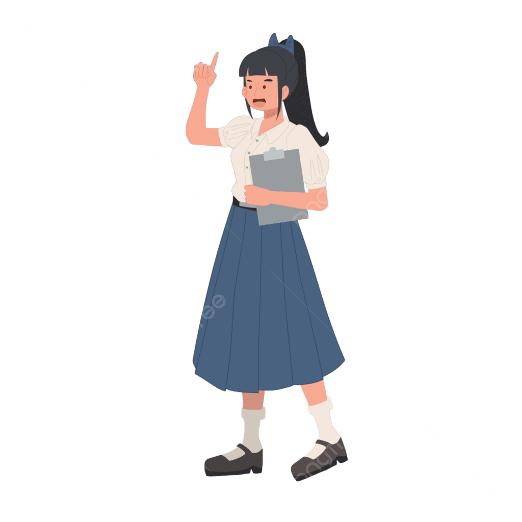

Name: Mei Lee
Age: 10 years old
Occupation:
Primary school student, Bilingual classroom setting, Speaks Mandarin, still developing English skills at school
Pain Points:
Language Barriers, Easily Distracted, Needs Step-by-Step Guidance
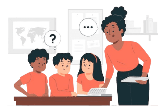

Name: Yolanda Gomez
Age: 34 years old
Occupation:
Primary school programming teachers, Bilingual classroom setting. First time teaching kids programming, aims to make programming approachable and fun for her students.
Paint Points:
Language Barriers, Classroom Time Constraints
Business Requirements for this homepage:
Following internal discussions with Professor Ko and the project management team, we identified key areas to improve the homepage to better meet user needs:
Content Creation Capabilities
Showcase tools and features for content creation, making it clear to school administrators how the platform supports classroom use and content development.
Justice-Centered Mission
Highlight the platform’s commitment to inclusive, justice-centered programming education to emphasize its mission and values.
Target Audience (Learners and Educators)
Tailor the homepage to engage both school administrators (demonstrating the platform’s benefits) and primary school students (using friendly visuals and language).
Ideate: Analysis user research result and prioritize solutions
I conducted user interviews to gather feedback and identified key pain points in the current homepage design, organizing the issues into four main areas.
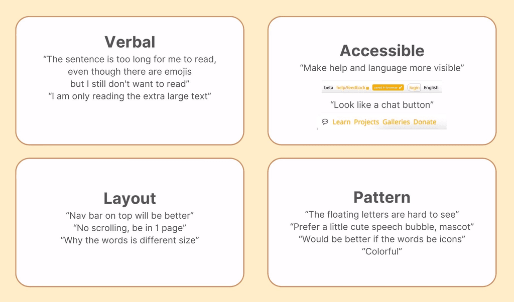

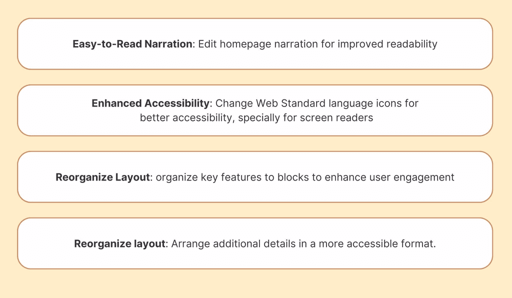
I provided solutions for each issue and prioritized them based on business requirements and our milestone to ensure a stable and accessible user experience, I then collaborated with my professor and developers to identify the most effective feature to implement next:

Prototype: Final design and proposed solution


My contribution 2:
Group Unicode symbols into browsable categories
Previous glyph chooser
vs.
New glyph chooser



Previous design
Glyph chooser is disorganized.
Search results are irrelevant.
Some Unicode characters are not displayed due to existing bugs.
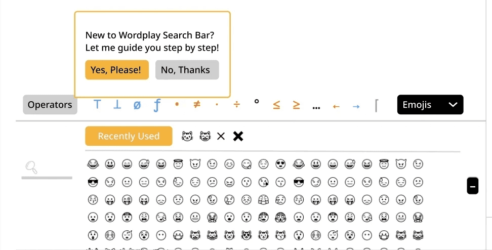
New design
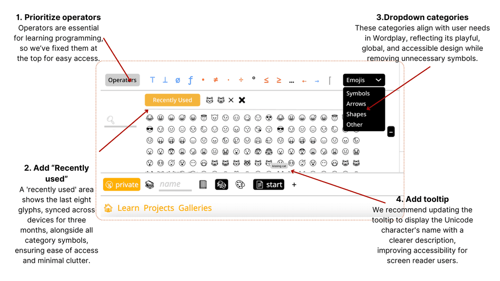
Organizes Unicode characters into categories displayed as dropdown menus.
Prioritizes operators for easier access.
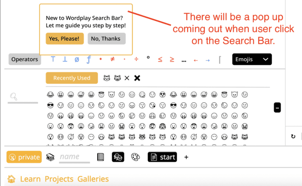
Provides an onboarding tutorial for first time user.
Back to the design process:
Our Objective: Enhance Unicode search with organization, accuracy, and multilingual support.
Define: Understand Unicode: What is unicode?
My first step is to research Unicode and explore its background. Unicode is a universal character encoding standard that assigns unique code points to characters, enabling consistent representation of text across languages, scripts, and platforms. For details on its organization, refer to the Unicode Data Format.
Review Unicode in Wordplay to craft tailored design solutions
The next step is to review the code and understand how Wordplay implements Unicode within the platform. This ensures that the design solutions align with technical requirements and are both practical and feasible.
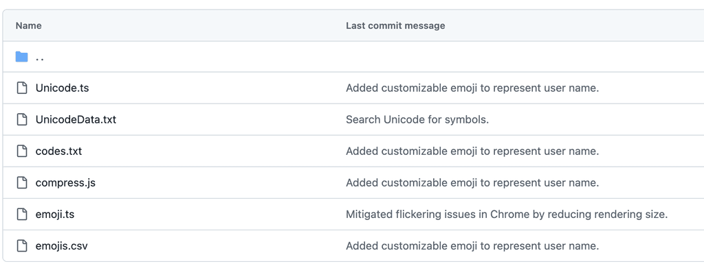

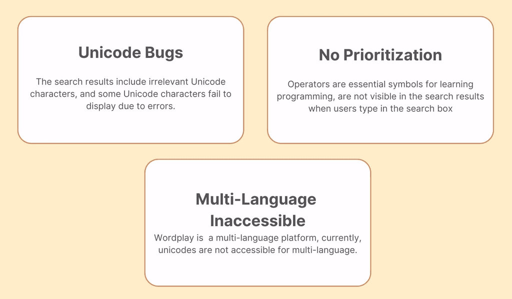
Ideate: After testing the current Unicode feature,
we identified the following main problems.

Prototype: Proposed solution
UI redesign

Multi-Language friendly
Our current design includes all Unicode glyphs and symbols, but they are only accessible with English descriptions. This limits the Wordplay search box to English, failing to yield results for terms in other languages. For instance, searching for 'Comida' (Spanish for 'Food') in both English and Spanish settings produces no results.
To enhance accessibility, we plan to incrementally translate the most commonly used Unicode, starting with those popular among elementary to middle school students. We suggest that the locale team could handle the translations by category, or we could enlist external contributors for this task.
3. Future Considerations
Tutorials
Offering tutorials to guide them through our features would be beneficial, helping them navigate and avoid feeling overwhelmed.

Expanding dropdown categories to incorporate more of the translated unicode
As our proficiency in translating Unicode advances, we have the opportunity to include a broader range of language symbols, such as Han Zi (the Mandarin Chinese term for Han characters). According to the official Unicode explanation, the comprehensive coverage extends to languages written in various widely-used scripts. (the full explanation can be found in the insert link)
When users switch to a specific language, we can enhance the dropdown menu by incorporating a dedicated section that shows the unique character categories relevant to that language.


Takeaways & Reflections
This project deepened my commitment to creating inclusive and accessible designs, particularly in the context of equitable educational opportunities. Tackling accessibility challenges reinforced the importance of thoughtful design choices and their impact on usability. Collaborating with developers enhanced my ability to align technical constraints with user-focused goals, while iterative problem-solving honed my adaptability. This experience strengthened my empathy-driven design philosophy, emphasizing inclusivity, usability, and scalability, and solidified my dedication to continuous learning and applying design principles in real-world scenarios.
If you'd like to learn more about Wordplay, please click the link below to access the beta version.

Back to the design process:
The Objective
Align the homepage with its intended audience
and emphasize our justice-focused mission.
Empathize & Define: Who are we designed for?


Name: Mei Lee
Age: 10 years old
Occupation:
Primary school student, Bilingual classroom setting, Speaks Mandarin, still developing English skills at school
Pain Points:
Language Barriers, Easily Distracted, Needs Step-by-Step Guidance


Name: Yolanda Gomez
Age: 34 years old
Occupation:
Primary school programming teachers, Bilingual classroom setting. First time teaching kids programming, aims to make programming approachable and fun for her students.
Paint Points:
Language Barriers, Classroom Time Constraints
Business Requirements for this homepage:
Following internal discussions with Professor Ko and the project management team, we identified key areas to improve the homepage to better meet user needs:
Content Creation Capabilities: Showcase tools and features for content creation, making it clear to school administrators how the platform supports classroom use and content development.
Justice-Centered Mission: Highlight the platform’s commitment to inclusive, justice-centered programming education to emphasize its mission and values.
Target Audience (Learners and Educators): Tailor the homepage to engage both school administrators (demonstrating the platform’s benefits) and primary school students (using friendly visuals and language).
Ideate: Analysis user research result and prioritize solutions
Ideate:
Analysis user research result
and prioritize solutions
I conducted user interviews to gather feedback and identified key pain points in the current homepage design, organizing the issues into four main areas.


I provided solutions for each issue and prioritized them based on business requirements and our milestone to ensure a stable and accessible user experience, I then collaborated with my professor and developers to identify the most effective feature to implement next:


Prototype: Final design and proposed solution


My contribution 2:
Group Unicode symbols into browsable categories
Previous glyph chooser vs. New glyph chooser


Previous design
Glyph chooser is disorganized.
Search results are irrelevant.
Some Unicode characters are not displayed due to existing bugs.
New design
Organizes Unicode characters into categories displayed as dropdown menus.
Prioritizes operators for easier access.
Provides an onboarding tutorial for first time user.
New design
Organizes Unicode characters into categories displayed as dropdown menus.
Prioritizes operators for easier access.
Provides an onboarding tutorial for first time user.
Back to the design process:
Our Objective: Enhance Unicode search with organization, accuracy, and multilingual support.
Back to the design process:
Our Objective: Enhance Unicode
search with organization, accuracy,
and multilingual support.
Define: Understand Unicode: What is unicode?
My first step is to research Unicode and explore its background. Unicode is a universal character encoding standard that assigns unique code points to characters, enabling consistent representation of text across languages, scripts, and platforms. For details on its organization, refer to the Unicode Data Format.
Review Unicode in Wordplay to craft tailored design solutions
The next step is to review the code and understand how Wordplay implements Unicode within the platform. This ensures that the design solutions align with technical requirements and are both practical and feasible.
Review Unicode in Wordplay to
craft tailored design solutions
The next step is to review the code and understand how Wordplay implements Unicode within the platform. This ensures that the design solutions align with technical requirements and are both practical and feasible.


Ideate: After testing the current Unicode feature,
we identified the following main problems.
Ideate: After testing the current Unicode feature,
we identified the following main problems.


Prototype: Proposed solution
Prototype: Proposed solution
UI redesign
UI redesign


Multi-Language friendly
Our current design includes all Unicode glyphs and symbols, but they are only accessible with English descriptions. This limits the Wordplay search box to English, failing to yield results for terms in other languages. For instance, searching for 'Comida' (Spanish for 'Food') in both English and Spanish settings produces no results.
To enhance accessibility, we plan to incrementally translate the most commonly used Unicode, starting with those popular among elementary to middle school students. We suggest that the locale team could handle the translations by category, or we could enlist external contributors for this task.
3. Future Considerations
Tutorials
Offering tutorials to guide them through our features would be beneficial, helping them navigate and avoid feeling overwhelmed.
3. Future Considerations
Tutorials
Offering tutorials to guide them through our features would be beneficial, helping them navigate and avoid feeling overwhelmed.


Expanding dropdown categories to incorporate more of the translated unicode
As our proficiency in translating Unicode advances, we have the opportunity to include a broader range of language symbols, such as Han Zi (the Mandarin Chinese term for Han characters). According to the official Unicode explanation, the comprehensive coverage extends to languages written in various widely-used scripts. (the full explanation can be found in the insert link)
When users switch to a specific language, we can enhance the dropdown menu by incorporating a dedicated section that shows the unique character categories relevant to that language.


Takeaways & Reflections
Takeaways & Reflections
This project deepened my commitment to creating inclusive and accessible designs, particularly in the context of equitable educational opportunities. Tackling accessibility challenges reinforced the importance of thoughtful design choices and their impact on usability. Collaborating with developers enhanced my ability to align technical constraints with user-focused goals, while iterative problem-solving honed my adaptability. This experience strengthened my empathy-driven design philosophy, emphasizing inclusivity, usability, and scalability, and solidified my dedication to continuous learning and applying design principles in real-world scenarios.
If you'd like to learn more about Wordplay, please click the link below to access the beta version.
