Artisk
Gen AI brand visual asset management Platform
Artisk
Gen AI brand visual asset management Platform
Artisk
Gen AI Brand Visual Asset
Management Platform


Project type: B2C Web App
Role: UX Research, UI/UX Designer
Industry: Design. AI, Technology
Duration: Summer 2024 - Winter 2024
Project type: B2C Web App
Role: UX Research, UI/UX Designer
Industry: Design. AI, Technology
Duration: Summer 2024 - Winter 2024
Project type: B2C Web App
Role: UX Research, UI/UX Designer
Industry: Design. AI, Technology
Duration: Summer 2024 - Winter 2024
What is Artisk?
What is Artisk?
Artisk is a platform that leverages cutting-edge AI technology to streamline the design process and make it accessible to everyone—even those without a design background. Its intuitive AI-driven tools empower users to swiftly transform their ideas into high-quality visuals, while its tailored design systems provide the guidance and structure needed to help newcomers succeed.
Click here to try Artisk
My contribution :
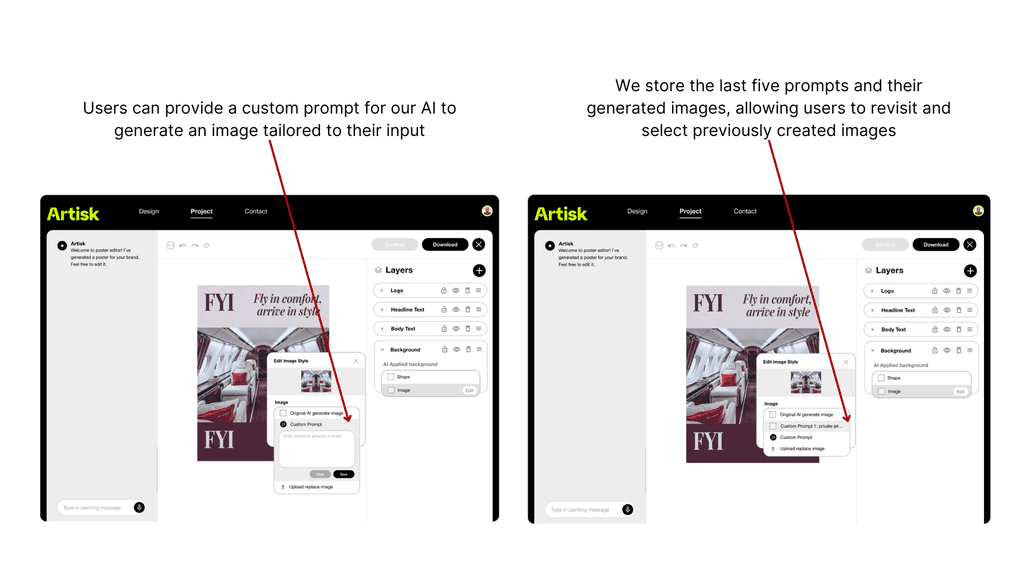
Designing a poster generator as a new feature
The Objective:
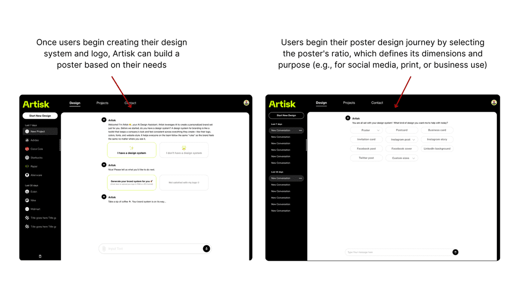
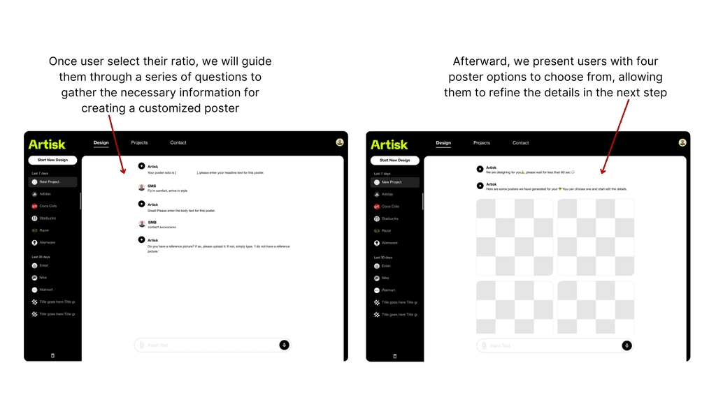
Generate posters for users based on their design system
My contribution :
Designing a poster generator as a new feature
The Objective:
Generate posters for users based on their design system
My contribution :
Designing a poster generator as a new feature
The Objective:
Generate posters for users based on their design system
Empathize:
Who are we designed for?


Name: Jackson Smith
Age: 40 years old
Occupation:
Business Owner, starting a local business; He is eager to establish a strong brand identity for his new business but is intimidated by complex design software.
Pain Points:
Lack of design knowledge, time constraints, limit budgets
Define:
Business design goal
for this feature
User-Friendly Interface: Develop an interface that is easy to navigate, ensuring all users can efficiently access and utilize the feature.
Streamlined Chat Flow: Implement a chat flow that allows users to choose from preset content options, reducing the need for manual input and simplifying the user experience.
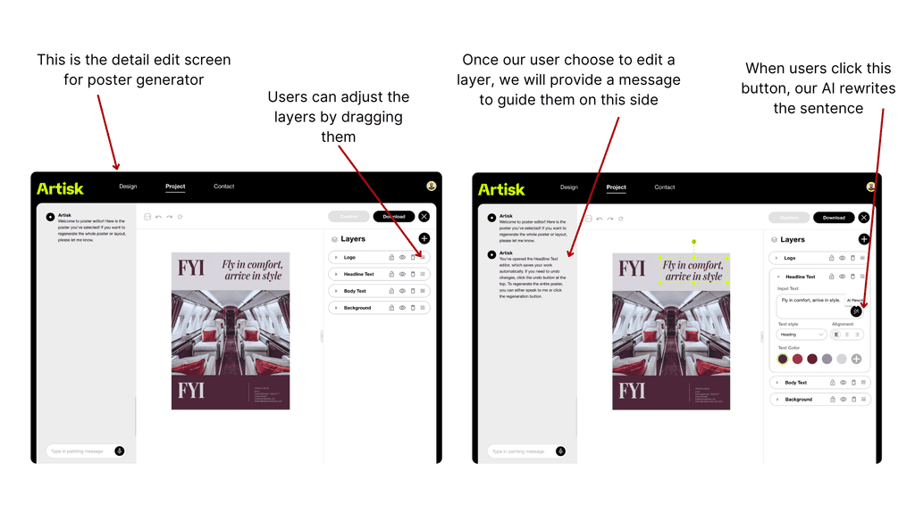
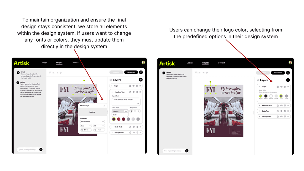
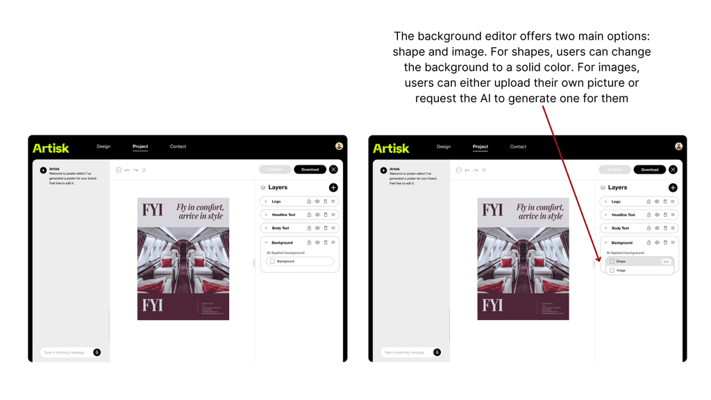
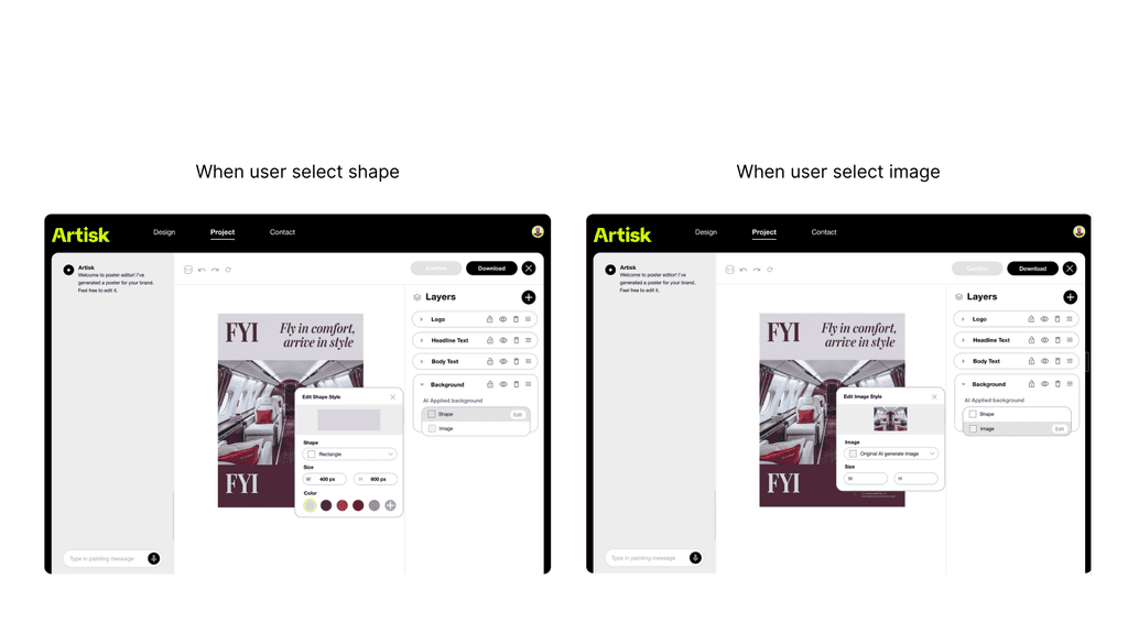
AI-Driven Analysis and Generation: Utilize advanced AI to automatically generate posters and analyze them, separating the design into distinct layers (logo, text, background), which users can individually customize.
Ideate: Potential Solutions, and how solutions with benefit our users
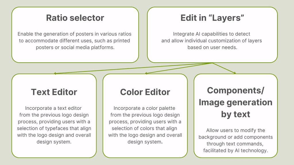
After discussing with the team, we have identified and prioritized the essential components that this new feature must include.

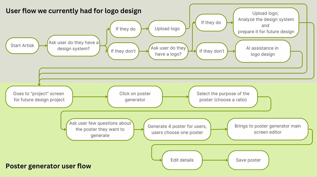
After considering the essential components, I created a user flow chart for the new feature, which connects to the current flow we had for logo design.

Prototype & Iteration:
From sketches to final design
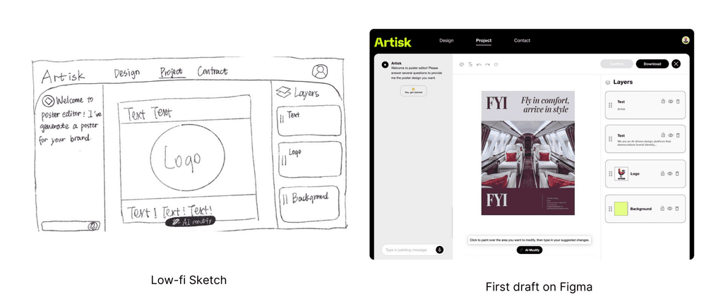
Firstly, I created a low-fidelity sketch to outline the layout, then proceeded to refine the details.

Throughout the design process, I collaborated with developers and co-worker from other teams, leading to several iterations and refinements of this feature.
Iteration 1:
Layer panel UI redesign
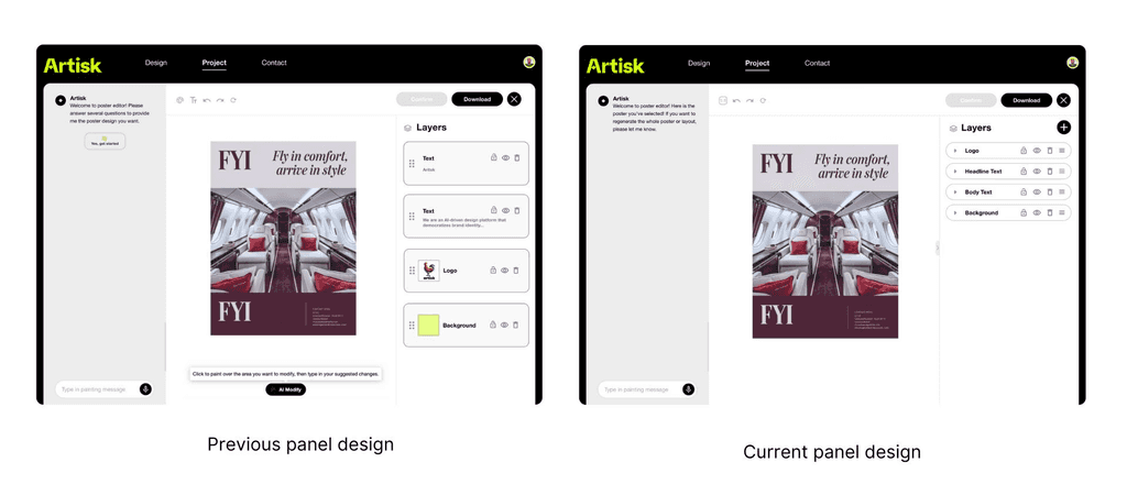
The first design refinement I made concerned the layers panel in the AI-generated poster editor. Initially, the panel was large and non-intuitive, as it didn't resemble an editable interface. Following feedback from multiple users during testing, I redesigned the panel to be thinner and more streamlined and user are able to turn on this panel to edit the details.

Iteration 2:
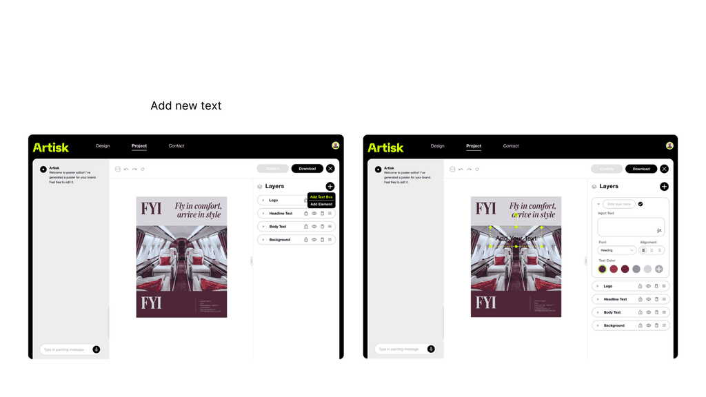
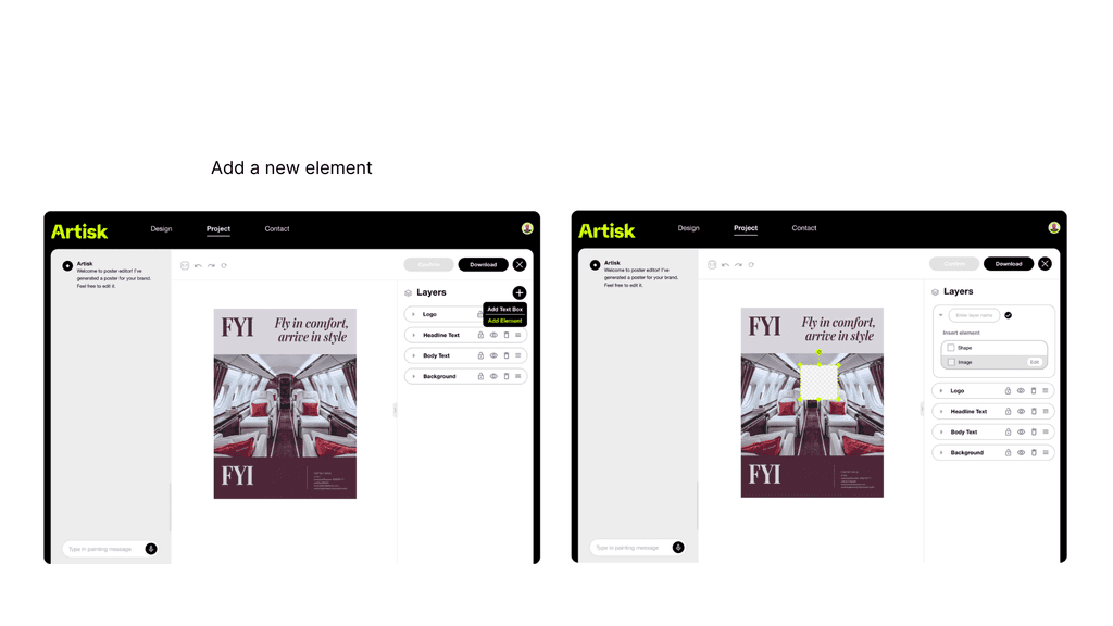
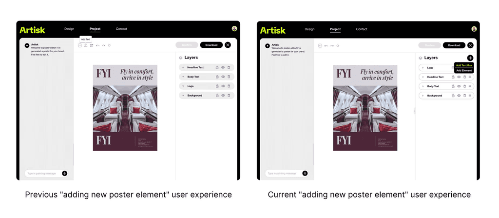
Enhancing the User Experience for Adding New Layers and Poster Elements
After I fixed the UI of the layer panel, I began considering how users would interact when adding new layers. At first, I thought of placing the layer-adding feature in the top navigation bar, but I soon realized the limitations of that approach. The current design on the right, which likely appeals more to users, addresses these issues by employing a streamlined, simplified layout that enhances usability and aesthetic appeal. Positioning the toolbar at the top, within easy reach, and reducing visual complexity minimizes cognitive load and prevents a cluttered feel. Additionally, the enlarged design canvas directs users’ attention to their creative work, making the design process more intuitive.

Iteration 3:
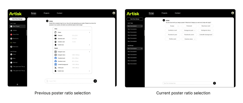
Redesign Poster Ratio Selection
In the original user flow for selecting poster ratios, the design presented a clear and straightforward list for users to choose from. However, during team discussions, we identified the need for a more flexible and iterative approach that better integrates with the overall design system. The new layout replaces the list with a horizontally grouped arrangement of clickable buttons, maintaining clarity while improving the user’s browsing and selection experience by reducing cognitive load. By aligning with the overarching visual language and usability principles, this redesign offers a more consistent, intuitive, and engaging user experience.

Empathize: Who are we designed for?

Name: Jackson Smith
Age: 40 years old
Occupation:
Business Owner, starting a local business; He is eager to establish a strong brand identity for his new business but is intimidated by complex design software.
Pain Points:
Lack of design knowledge, time Constraints, limit Budgets
Define: Business design goal for this feature
User-Friendly Interface: Develop an interface that is easy to navigate, ensuring all users can efficiently access and utilize the feature.
Streamlined Chat Flow: Implement a chat flow that allows users to choose from preset content options, reducing the need for manual input and simplifying the user experience.
AI-Driven Analysis and Generation: Utilize advanced AI to automatically generate posters and analyze them, separating the design into distinct layers (logo, text, background), which users can individually customize.
Ideate: Potential Solutions, and how solutions with benefit our users
Ideate: Potential Solutions, and how solutions with benefit our users
After discussing with the team, we have identified and prioritized the essential components that this new feature must include.


After considering the essential components, I created a user flow chart for the new feature, which connects to the current flow we had for logo design.


Prototype & Iteration: From sketches to final design
Firstly, I created a low-fidelity sketch to outline the layout, then proceeded to refine the details.


Throughout the design process, I collaborated with developers and co-worker from other teams, leading to several iterations and refinements of this feature.
Iteration 1:
Layer panel UI redesign
The first design refinement I made concerned the layers panel in the AI-generated poster editor. Initially, the panel was large and non-intuitive, as it didn't resemble an editable interface. Following feedback from multiple users during testing, I redesigned the panel to be thinner and more streamlined and user are able to turn on this panel to edit the details.


Iteration 2:
Enhancing the User Experience for Adding New Layers and Poster Elements
After I fixed the UI of the layer panel, I began considering how users would interact when adding new layers. At first, I thought of placing the layer-adding feature in the top navigation bar, but I soon realized the limitations of that approach. The current design on the right, which likely appeals more to users, addresses these issues by employing a streamlined, simplified layout that enhances usability and aesthetic appeal. Positioning the toolbar at the top, within easy reach, and reducing visual complexity minimizes cognitive load and prevents a cluttered feel. Additionally, the enlarged design canvas directs users’ attention to their creative work, making the design process more intuitive.


Iteration 3:
Redesign Poster Ratio Selection
In the original user flow for selecting poster ratios, the design presented a clear and straightforward list for users to choose from. However, during team discussions, we identified the need for a more flexible and iterative approach that better integrates with the overall design system. The new layout replaces the list with a horizontally grouped arrangement of clickable buttons, maintaining clarity while improving the user’s browsing and selection experience by reducing cognitive load. By aligning with the overarching visual language and usability principles, this redesign offers a more consistent, intuitive, and engaging user experience.


Takeaways & Reflections
Through my experience with Artisk, I gained invaluable insights into designing for a real-world project in a business context, which is vastly different from internships, part-time roles, or class projects. Working on Artisk required me to align design decisions with clear business goals, ensuring every feature—like AI-guided poster creation and customization—contributed to both user satisfaction and business outcomes. I learned to collaborate closely with developers, translating user needs and design concepts into actionable requirements while navigating technical constraints. Unlike academic projects, where the focus is often on exploring ideas, Artisk taught me how to prioritize features, iterate quickly, and balance creativity with feasibility to meet tight deadlines. This experience helped me understand how to effectively communicate and work across teams, bridging the gap between design, development, and business strategies to deliver a polished, real-world product.
If you'd like to learn more about Wordplay, please click the link below to access Artisk's official website.

Final Solution:
Final Solution:
Takeaways & Reflections
Takeaways & Reflections
Through my experience with Artisk, I gained invaluable insights into designing for a real-world project in a business context, which is vastly different from internships, part-time roles, or class projects. Working on Artisk required me to align design decisions with clear business goals, ensuring every feature—like AI-guided poster creation and customization—contributed to both user satisfaction and business outcomes. I learned to collaborate closely with developers, translating user needs and design concepts into actionable requirements while navigating technical constraints. Unlike academic projects, where the focus is often on exploring ideas, Artisk taught me how to prioritize features, iterate quickly, and balance creativity with feasibility to meet tight deadlines. This experience helped me understand how to effectively communicate and work across teams, bridging the gap between design, development, and business strategies to deliver a polished, real-world product.
If you'd like to learn more about Artisk, please click the link below to access Artisk's official website.
